May 26, 201510 yr Haven't played with lettering in awhile. quick feedback? detailed as possible please. Edited May 26, 201510 yr by OurSickStory
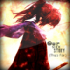
May 26, 201510 yr I think you were trying a bit too hard for the capital letters to be original. Personally I'm a huge fan of simplicity. The lettering besides the S, D, and g, are all very nice and the texture/glow were done pretty well.
May 26, 201510 yr Author Thanks alek, exactly what I was looking for. Just pulled out Gimp after about a year break so every bit helps!
May 26, 201510 yr The bottom image, has way too many textures/layer styles on it. Like Alek said, I like simplicity as well, so I'm not a huge fan of it. The glow on the "s" for the bottom image is too much imo as well.


Create an account or sign in to comment