


Relax
Members
-
Joined
-
Last visited
Everything posted by Relax
-
This is really well done, I'm liking this a lot. One of the better showcases on this forum
-
-
GL peeps I wish voting was public!
-
Awesome tag ! Only thing that could be improved slightly is lighting in some parts. Great work, I love it.
-
? No need to be a dick about it m8. Completely unnecessary.
-
They're nice, but I really can't see that much of a difference to the original apart from that yours has an outerglow, slightly different shading and obviously the icons. The clarity of your text is also not as good as the originals
-
Any more entries?
-
Oh wow, damn. C'mon guys, make a sig :-)! This is an awesome little competition that Dark is doing, get involved
-
I made this thread layout yesterday, it is specifically for a Firecape service, however I can change it around to suit another service if need be. Everything apart from the header "Firecape service" is customisable, e.g. Colours, text, font, etc. If you'd like a different header, that can also be arranged. Selling this layout for a minimum of $10 Post here if you're interested, or add my Skype: b_designs Click the spoiler to show
-
Goodluck everyone ! Just letting you know, DarkzSide, I'm unable to send you my entry. I get the error: "The member DarkzSide cannot receive any new messages".
-
-
There is no way in the world that that is Katy Perry lmao. Nice sig, very well done
-
> CLICK TO SHOW < EXAMPLES SHOWN BELOW ARE CUSTOMISABLE AND FOR SALE, MORE EXAMPLES WILL BE ADDED AS I COMPLETE ORDERS. PLEASE BEAR WITH ME AS I REBUILD MY PORTFOLIO. (Signature & Thread made by me). THREAD EXAMPLES TITLED SIGNATURES 3D TEXT ORDER FORM Do you agree to the ToS [Y/N]: Type of Graphic: Animation [Y/N]: Description: Colours/Themes: Example(s): Images/Renders: Contact info: Payment method [PayPal/OSRS GP]: Have you added my Skype: Other information:
-
Sure thing, I'll add you in a minute
-
Yes, I've seen the work you do but I'm not intimidated or overly impressed so I'd appreciate if you didn't treat me as such. It is not a competition, believe it or not. I also saw that you practice photography also, which is cool, as do I. I'd love to have a gander at more of your photos. For future reference, I don't take well to "friendly toughness" or "tough love", as there is no such thing.
-
I've been in numerous Graphics subs and forums before and I can tell what is genuine constructive criticism, and what is not. You are flaring your ego because I am new to the sub, sorry to say. You've posted on less appealing works of I assume, your friends, and have praised them with no criticism. I'm sorry if I'm sounding very assertive, but I don't appreciate hostility after I've already taken into consideration what you've said, it's unnecessary :\
-
The fact that you had to supply a definition from google means you really don't understand the term "Abstract". I don't know why you're being so hostile towards me, but it is an abstract smudge. I did not say the render was abstract, because you were referring to the smudging, not the render being "random". I'd appreciate if you left the thread if you are just going to be negative and unencouraging, thanks
-
Yes, that is abstract, but abstract comes in all shapes and forms. This tag is an abstract smudge.
-
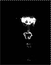
I can appreciate the fact that you guys obviously don't like abstract or understand much about it, the whole idea of abstract is the randomness of it. The tag itself has a direct flow, however. The depth in my opinion is fine and the hand is not floating, it is being consumed by the 'smoke clouds', per say. The tag is intentionally blurred, mainly certain parts of the background to create a smokey, dreamy feel to it. There is however a definitive separation between parts that are meant to be blurred and parts that are not. I agree that the light is a bit too harsh in some areas, i.e. the chest and where it does abruptly stop to the left hand side. Thanks
-
Care to elaborate?
-
Thanks m8 I'll take that into consideration. Strange that the colours are very dull in your screen cap of my sig, too.
-
Well, it's really an abstract smudge with the render sort attempting to tear out of it whilst he is disintegrating. The colour choices resemble fire/smoke. I'm fine with criticism as long as it's constructive.
-
Hey guys, I'm new here but a main hobby of mine has always been Graphic design, so I thought I would come and participate in this sub. I haven't done any design in a very long time, so I may be a bit rusty. It may be worth to mention that my avatar & signature were also made by me
-
Your script is honestly flawless, Czar. Another proggy for you on a separate account, :-) The xp p/h would be higher, but I took small breaks here and there. Thanks so much
-
Here's a nice lil proggy for you Czar :-)

